Built for brains

that wander

Built for brains

that wander

Built for brains

that wander

A task management app for users

struggling to break down their task

View Prototype

Duration

10 Weeks

Tools

Figma, FigJam

Role

UX/ UI Designer

Team

Independent

The Inspiration

The Inspiration

As I was walking down the street, I noticed signs for accessibility access and wondered: How accessible is this world? Are there areas still lacking inclusivity? What about the digital space—are apps truly designed for everyone, or are some groups being left behind? These questions sparked my curiosity and led me to explore the problem space of accessibility, driving me to create a solution that prioritises inclusivity and ensures no one is overlooked.

Discover

Discover

Discover

Problem Space

Problem Space

I focused on ADHD accessibility and found that many workplaces aren’t built for neurodivergent people, making productivity, job stability, and support a challenge, I wanted to help change that.
People with ADHD struggle to stay on top of tasks and manage their workload in a way that works for them.

Secondary Research

Secondary Research

I started by researching ADHD in the workplace to understand the challenges neurodivergent employees face. Turns out, they struggle much more with job security and career growth, highlighting just how poorly workplaces support them reinforcing the need for a real solution.

1 in 20 adults try to navigate life with ADHD

60%

More likely to be fired

More likely to be fired

30%

More likely to face chronic

employment challenges

More likely to face chronic

employment challenges

3x

More likely to quit

on an impulse

More likely to quit

on an impulse

Primary Research

Primary Research

Meet the Participants

Meet the Participants

To deepen my understanding of the problem and ensure my assumptions were accurate, I conducted three user interviews with individuals who have ADHD. I chose interviews as my primary research method because ADHD challenges in the workplace go beyond statistics, I wanted to hear real experiences, frustrations, and needs directly from those affected. These conversations gave me valuable insights into how ADHD impacts productivity, job stability, and daily work life, helping me shape a more meaningful solution.

Z.A

Age: 22
Occupation: Teacher

M.B

Age: 21
Occupation: Lawyer

A.A

Age: 21
Occupation: Data Scientist

Z.A

Age: 22
Occupation: Teacher

M.B

Age: 21
Occupation: Lawyer

A.A

Age: 21
Occupation: Data Scientist

Affinity Mapping

Affinity Mapping

To speed up my research and have a full script ready, I used Notta to transcribe the interview recordings. I then went through the notes, pulling out key quotes and spotting patterns.

I transferred the most relevant quotes onto a FigJam board, sorting them into three categories: Pain Points, Behaviours, and Motivations. Here are some examples:

Pain Points

Motivations

Behaviours

Key Themes

1

Time Management & Task Prioritisation

Time feels wonky with ADHD, big or small, every task feels the same. People either procrastinate until the last minute or freeze up, unsure where to start.

2

Social Connection & Communication

If someone isn’t right there, they just disappear, out of sight, out of mind, plus, overthinking makes staying connected even harder.

3

Information Overload & Cognitive Overwhelm

Too much clutter, physical or digital, makes everything harder, but clear layouts and simple reminders bring back control.

Here’s what I found from talking to people with ADHD:

1

Time Management & Task Prioritisation

Time feels wonky with ADHD, big or small, every task feels the same. People either procrastinate until the last minute or freeze up, unsure where to start.

2

Social Connection & Communication

If someone isn’t right there, they just disappear, out of sight, out of mind, plus, overthinking makes staying connected even harder.

3

Information Overload & Cognitive Overwhelm

Too much clutter, physical or digital, makes everything harder, but clear layouts and simple reminders bring back control.

Define

Define

How might we help individuals with ADHD manage their time and prioritise tasks effectively so that they feel less overwhelmed and more in control of their daily responsibilities?

User Persona

User Persona

Meet Emma Carter, the heart of my research. Whenever I hit a roadblock, I ask, "What does Emma need?" She was shaped by the pain points, motivations, and behaviours uncovered in my user interviews, guiding every design decision.

Experience Mapping

Experience Mapping

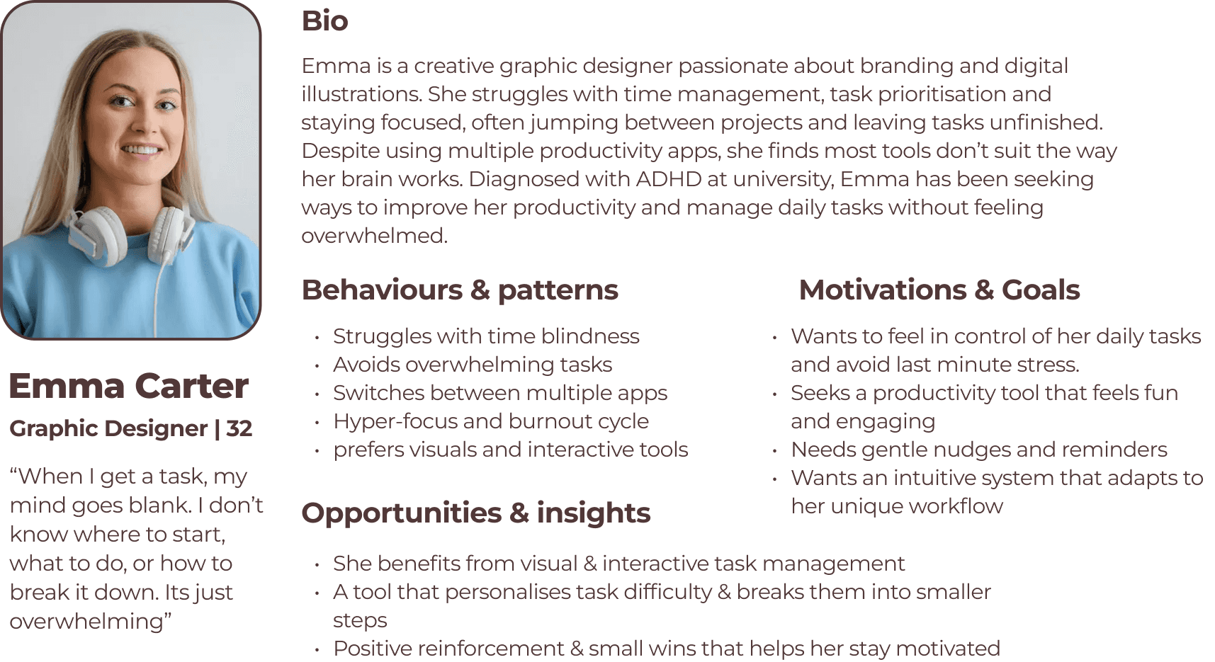
I mapped out Emma Carter’s journey, stepping into her shoes to understand what it’s like navigating tasks with ADHD. From the moment she sits down to work, distractions creep in, time slips away, and overwhelm takes over.

By breaking her journey into key phases, what she does, thinks, and feels, I uncovered where frustration builds and where design can step in to help. This process highlighted the biggest opportunities to create a tool that truly supports her workflow, rather than fights against it.

User Stories

User Stories

Focusing on the essential features for my MVP, I prioritised the core functions that would help Emma better manage her tasks and stay on top of her responsibilities. I created user stories and grouped them into epics to ensure the solution directly addresses her needs, particularly in task management and maintaining meaningful social connections throughout her workday.

Task Flow

Task Flow

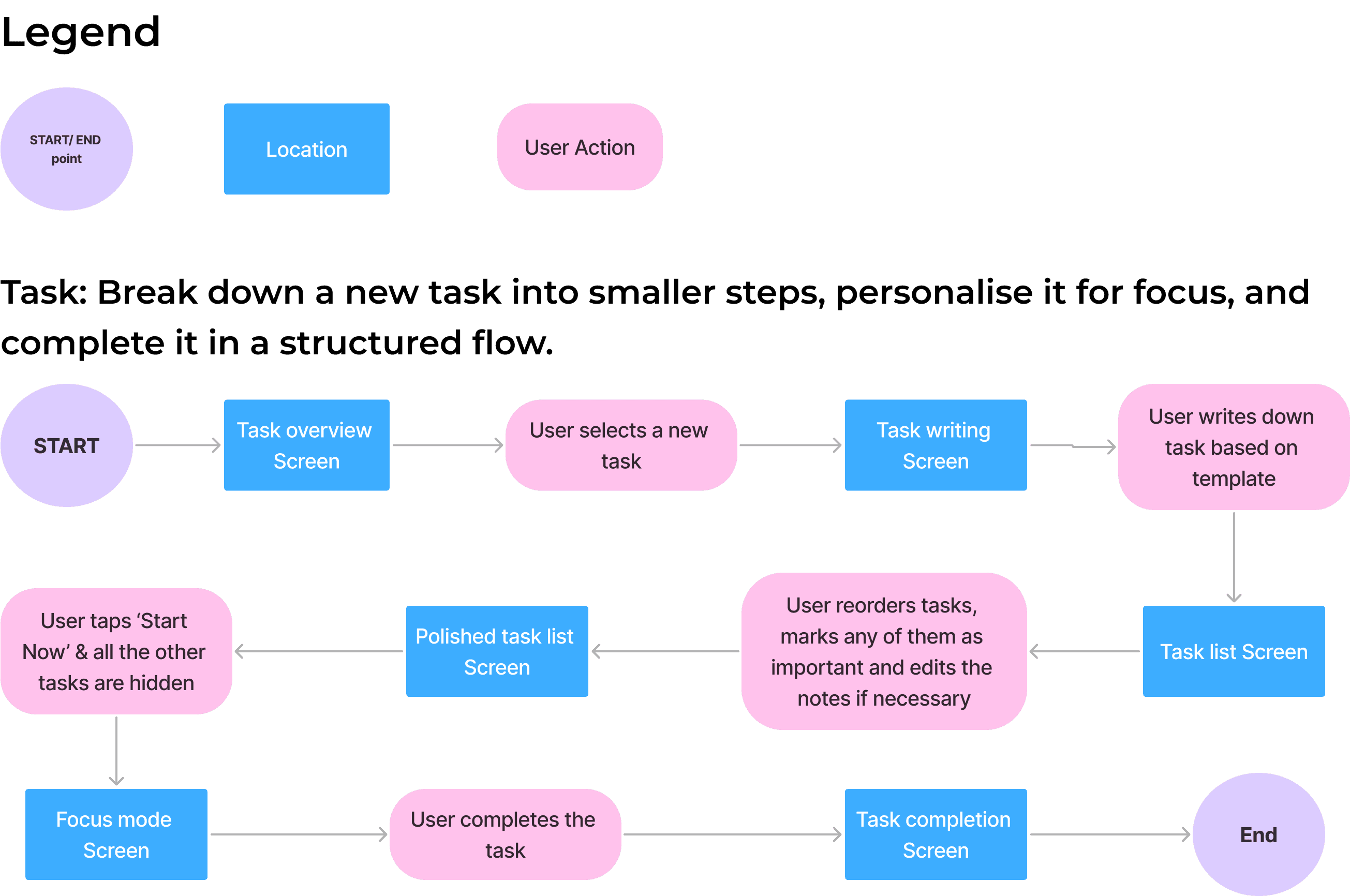
I imagined Emma opening the app feeling overwhelmed and unsure where to start. The task flow guides her step by step — from writing a task with a template, to hiding distractions, to staying focused with one step at a time in Focus Mode.

Each screen was designed with her ADHD needs in mind: clarity, flexibility, and support. I refined the flow through testing and feedback, making sure it helped Emma feel more in control, not more stressed.

Design

Design

Initital Sketches

I based my sketches on my task flow, keeping my persona, Emma, in mind to prioritise usability and accessibility. Instead of focusing on visuals, I ensured the layout worked intuitively. My UI inspiration board, featuring task apps and certain games, helped shape key elements.

The gamification idea, introducing a pet companion, came unexpectedly during a Crazy 8s session, as I looked for ways to make task management more engaging for Emma. I prioritised only the features directly impacting the task flow, refining them through user feedback since I don’t have ADHD myself. My inspiration board played a key role in keeping everything structured and user-friendly.

Solution Sketches & Initial Wireframe

Solution Sketches & Initial Wireframe

After sketching out a bunch of ideas, I picked the ones that felt the most intuitive and ADHD-friendly basically, the ones that made task management less of a chore. I mixed the best bits together into solution sketches, making sure everything flowed smoothly.

Once things started clicking, I moved them into Figma as low-fidelity wireframes, keeping it simple and focused on usability first. The fun, playful elements could come later. First, it had to work!

User Testing

User Testing

I ran two rounds of usability testing with a total of 10 participants, each offering valuable insights into how the design could better support users with ADHD.

After each round, I used a Design Prioritisation Matrix to decide which feedback would have the biggest impact and was quickest to implement. This helped me make purposeful, user-led changes—like improving task visibility, simplifying navigation, and making the reward system clearer.

The design didn’t just evolve—it became smarter, more focused, and more helpful with every iteration.

Brand Development

Brand Development

Key words

Key words

When I started thinking about the brand identity, I jotted down a bunch of adjectives that captured the vibe I wanted the app to give off. Words like playful, supportive, and encouraging helped guide my choices as I built the moodboard. I picked out images, colours, and typography that reflected those feelings, something that would feel warm and motivating, especially for users who might feel overwhelmed.

Playful

Engaging

Calming

Motivating

Supportive

Playful

Engaging

Calming

Supportive

Motivating

Colour Palette

I originally picked #DFB389, a soft golden tone, to give the app a warm and playful feel. But when I tested it against #FCFCFC (the background colour), it didn’t pass accessibility checks. So I adjusted it to #866B52, a deeper, earthier shade that still felt cosy and inviting, while also being much easier to read.

To add a gentle splash of colour and help users visually distinguish between tasks, I introduced three soft accent shades—#DCEDD5 (green), #BDE7E7 (blue), and #FDD1CB (peachy pink). These colours are used sparingly to label tasks in a way that’s fun and supportive, without overwhelming the user. They reflect the light, friendly mood of the app while still staying accessible and focused.

#DFB389

#A7D397

#59C3C3

#F98C7E

Original colours

#866B52

#DCEDD5

#BDE7E7

#FDD1CB

Used in App

#DFB389

#A7D397

#59C3C3

#F98C7E

Original colours

#866B52

#DCEDD5

#BDE7E7

#FDD1CB

Used in App

#DFB389

#A7D397

#59C3C3

#F98C7E

Original colours

#866B52

#DCEDD5

#BDE7E7

#FDD1CB

Used in App

Name selection

When thinking of a name, I knew I wanted something fun, supportive, and maybe just a tiny bit cute. I jotted down words linked to pets, motivation, and play—basically anything that felt like a tiny cheerleader in app form.

That’s when “Fetch” came to life. It clicked instantly. It's playful, easy to remember, and gives off big loyal-dog-energy—the kind that’s always by your side, ready to help. Just like a dog fetches a ball, this app helps you fetch your goals (minus the slobber). It perfectly sums up the app’s vibe: fun, friendly, and all about making task management less “ugh” and more “yay!”

Wordmark

While playing around with fonts, I stumbled across Paw Wow by Hansco and it was love at first sight. It had the friendly curves of Atma, the playful vibe of Noteworthy, and the cutest hidden paw details (yes, really!). It felt warm, fun, and perfectly on brand for Fetch like a font playing catch with you.

Logo

To keep things cohesive, I turned the F in Fetch into a paw-print logo—swapping the middle bar for paw fingers to match the playful, pet theme. It’s simple, memorable, and totally on brand.

For colour, I used a gradient of the app’s accent colours—fun and vibrant in light mode, bold and punchy in dark mode—so the logo always feels full of life.

Dark Mode

Light Mode

UI Library

UI Library

When thinking of a name, I knew I wanted something fun, supportive, and maybe just a tiny bit cute. I jotted down words linked to pets, motivation, and play—basically anything that felt like a tiny cheerleader in app form.

That’s when “Fetch” came to life. It clicked instantly. It's playful, easy to remember, and gives off big loyal-dog-energy—the kind that’s always by your side, ready to help. Just like a dog fetches a ball, this app helps you fetch your goals (minus the slobber). It perfectly sums up the app’s vibe: fun, friendly, and all about making task management less “ugh” and more “yay!”

Deliver

Deliver

High Fidelity Prototype

Ready to see Fetch come to life and meet your new productivity buddy?

View Prototype

Marketing Website

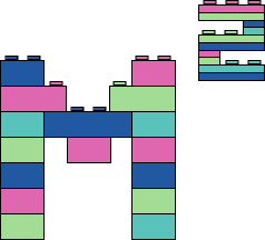
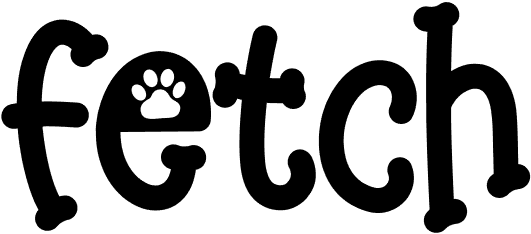
To promote Fetch and encourage downloads, I designed a responsive marketing site that clearly communicates the app’s purpose: helping users with ADHD break down tasks and stay motivated using a cute, gamified experience.

The site gives visitors a taste of the app’s personality, explains how it works, and encourages them to try it by highlighting key features like the Pomodoro timer, pet rewards, and task breakdown. It’s built to feel playful, helpful, and totally Fetch.

Key Takeaways

Key Takeaways

1

Functionality needs to come first.

Prioritised working, usable features over something that’s pretty

2

Accessibility, accessibility, accessibility

It had to be front and centre in everything I designed

3

User testing humbled me.

Too much clutter, physical or digital, makes everything harder, but clear layouts and simple reminders bring back control.

Lets build a connection.

Dont be shy ◡̈

Lets build a connection.

Dont be shy ◡̈

Lets build a connection.

Dont be shy ◡̈