


Duration
24 hours
Tools
Figma, FigJam
Role
UX/ UI Designer
Team
2 Data Scientists
1 Software Engineer
2 UX Designers
Outcome
Winning team
INTRODUCTION
Context
For BrainStation's 24-hour project, Revolut partnered with us as the industry collaborator. Our team, made up of two UX designers, a software engineer, and two data scientists, worked together to create a solution that effectively tackled the core challenges within the problem space.
Problem Space
Despite proliferation of financial tools and platforms, research shows that customers are more vulnerable than ever. It is in the best interests of banks to nurture financial literacy and improve access to finance education for consumers, encouraging customers to engage in practices that improve financial and overall well being.
Design Challenge
"How might we help users gain a clear and intuitive understanding of their spending habits, identifying areas for potential improvement without overwhelming them with data?"

Planning
BRAINSTORMING
Initial Plans
We knew the next 24 hours would be intense. With limited time, resources, and a small team, we had to collaborate efficiently to deliver a meaningful solution. For many of us, it was our first time working in a truly cross-functional setting, which made it even more exciting to observe and learn from the thought processes of different disciplines. I took an active role in keeping the team grounded, consistently reminding everyone to stay focused on solving the defined problem and avoid drifting beyond our scope. Our brainstorming session was highly vocal, open, and full of critical thinking, which led to a range of fantastic, well-considered ideas. This session set a strong foundation for our project, ensuring that every decision we made was tightly aligned with the user's needs and the core challenge we were addressing.
PRIMARY RESEARCH
Interviewing Revolut customers

PRODUCT RESEARCH
Existing Revolut Solution
To determine where to begin, we explored Revolut’s current app and walked through the user flow leading to the analytics page. We identified the strengths and weaknesses of each screen and evaluated the overall usability of the journey.


Persona
TARGET AUDIENCE
Who are we targeting?
To guide our design decisions and ensure our solution stayed user-focused, we created a proto-persona early in the process. By outlining key details such as age, background, goals, motivations, and frustrations, we were able to empathise with our target user and ground our ideation in real needs. This proto-persona became a crucial reference point during sketching, helping us tailor the experience to someone with specific financial behaviours and emotional responses. Even under tight time constraints, investing in this step ensured our solution wasn't just functional but meaningful and relevant to the user.
USER PERSONA
Meet Alex

NAME
AGE
PROFESSION
CITY
Alex Penn
28
Data Scientist
London, UK
Prioritises Convenience
Tech Savvy, Fitness Enthusiast
Spending Style: Impulsive Spender
Top Spend Categories: Dining Out & Video Games
MOTIVATIONS
Goal to buy a house in 2027
Wants a better understanding of his spending habits so he can start saving more intentionally
Overwhelmed and doesn’t know how to start tracking spending
Doesn’t have a clear idea on which categories or items he spends the most on and where he could spend less
PERSONA GOALS
What does Alex need?
Once we finalised our persona, the direction of our solution became much clearer. Having a defined user in mind allowed us to align our ideas with their specific needs and pain points. As a team, we were able to confidently converge on a final concept and begin solution sketching with a strong sense of purpose. This step brought clarity and focus to our process, helping us prioritise features that would deliver real value to the user.
Easier Access
Surface spending and savings information directly on the homepage to reduce friction and support quick, at-a-glance financial awareness.
More relevant
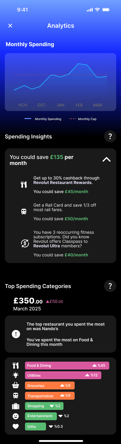
Use personalised recommendations based on individual spending patterns to help users make smarter financial decisions with confidence.
Smarter Insights
Break down spending into clear, digestible categories, enhanced with tailored insights, to help users better understand and manage their financial behaviour.
Design
SKETCHES
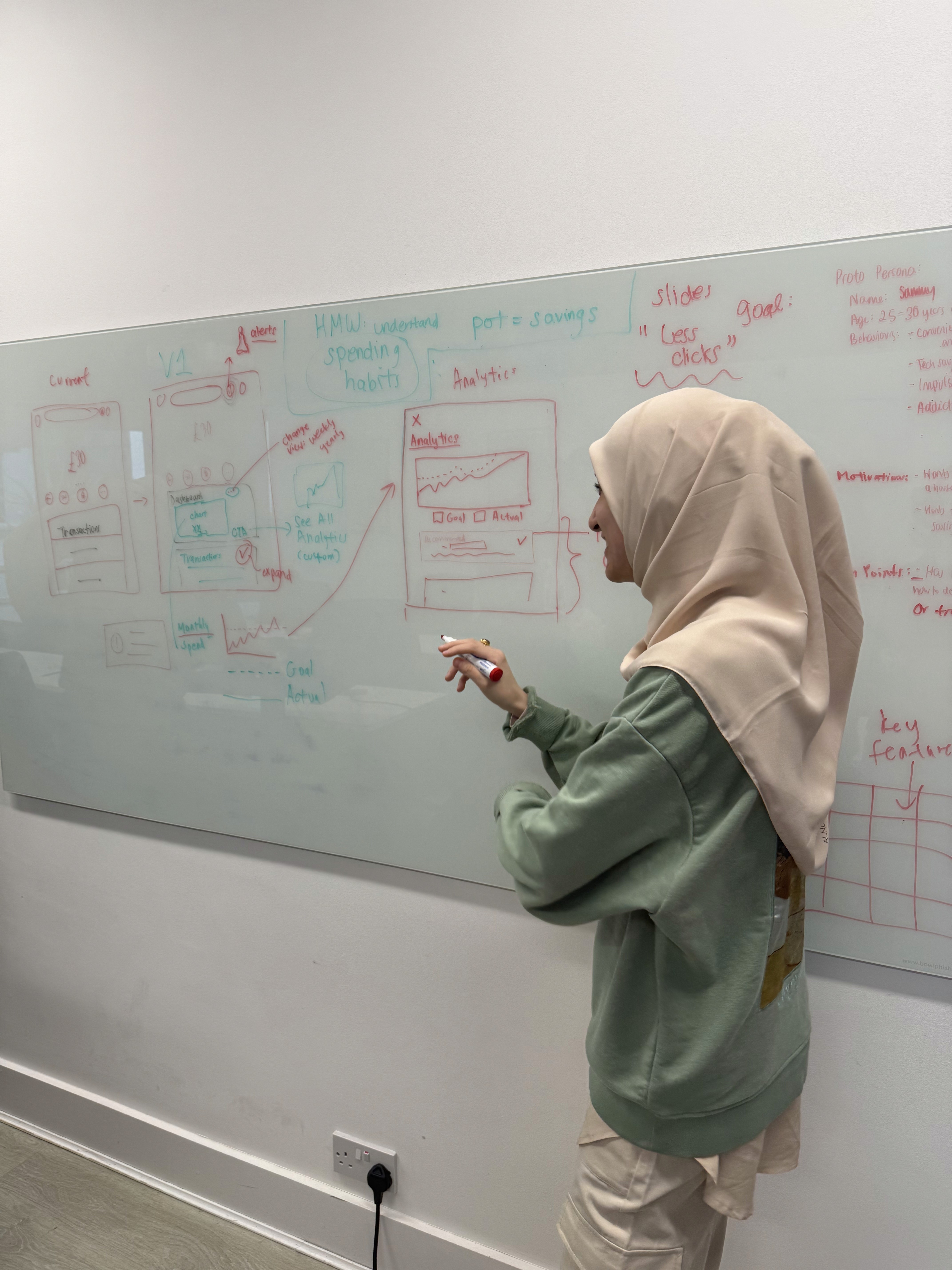
Whiteboard sketching
At this stage, we had clearly defined our new feature and were ready to move into ideation. It was time to combine our skills and start turning ideas into tangible designs. I encouraged everyone on the team, including the data scientists and our software engineer, to actively participate in the sketching process. By creating a space where all disciplines felt confident contributing, we were able to bounce ideas off one another and build on each other’s thinking. This collaborative energy led to a diverse set of sketches, each offering a unique perspective on how the solution could come to life. It was a great reminder that good design can come from anywhere and that cross-functional creativity is a powerful tool in UX.


Colours & Typography
We made sure our designs stayed true to Revolut’s brand by following their official guidelines. From the use of their signature blue gradients to clean typography and iconography, every visual element was chosen to blend seamlessly with the existing app. This ensured our solution felt consistent, trustworthy, and instantly recognisable to users.
SOLUTION WIREFRAMES
Colours & Typography


Deliver
PRESENTATION
Revealing our concept
We had the exciting opportunity to present our solution to a panel of four Revolut professionals. Our team delivered a particularly compelling pitch, not only solving the challenge but also showcasing opportunities to upsell Revolut’s existing products, something the panel especially appreciated. They were impressed by both the strength of our idea and the way we worked seamlessly as a cross-functional team. As a result, we were thrilled to be announced as the winning team, recognised for our innovative concept, collaboration, and clear understanding of Revolut’s brand and business goals.
